If you’ve ever poured your heart into a marketing campaign, only to watch visitors abandon your landing page without taking action, I feel your frustration. Designing an inbound marketing campaign is one thing—but creating a landing page that actually converts? That’s a whole other challenge. Thankfully, HubSpot’s powerful suite of inbound marketing tools can help us build landing pages that not only attract the right visitors but also turn them into leads and customers.
In today’s post, I’m going to walk you through how I build high-converting landing pages step-by-step using HubSpot. Whether you're just getting started or looking to refine your strategy, these are the principles and practical tips I rely on every day here at Inbound SEO.
Start With the End in Mind: What Do You Want Visitors to Do?
Before I even open HubSpot, I take a moment to clarify the purpose of the landing page. Are we aiming to collect email addresses? Promote a free resource like an ebook? Book consultation calls? Understanding the end goal shapes every decision—from the headline to the CTA button.
Trust me, this clarity prevents you from adding unnecessary content or distractions. With inbound marketing, less is more. We want to guide visitors toward a single, focused action.
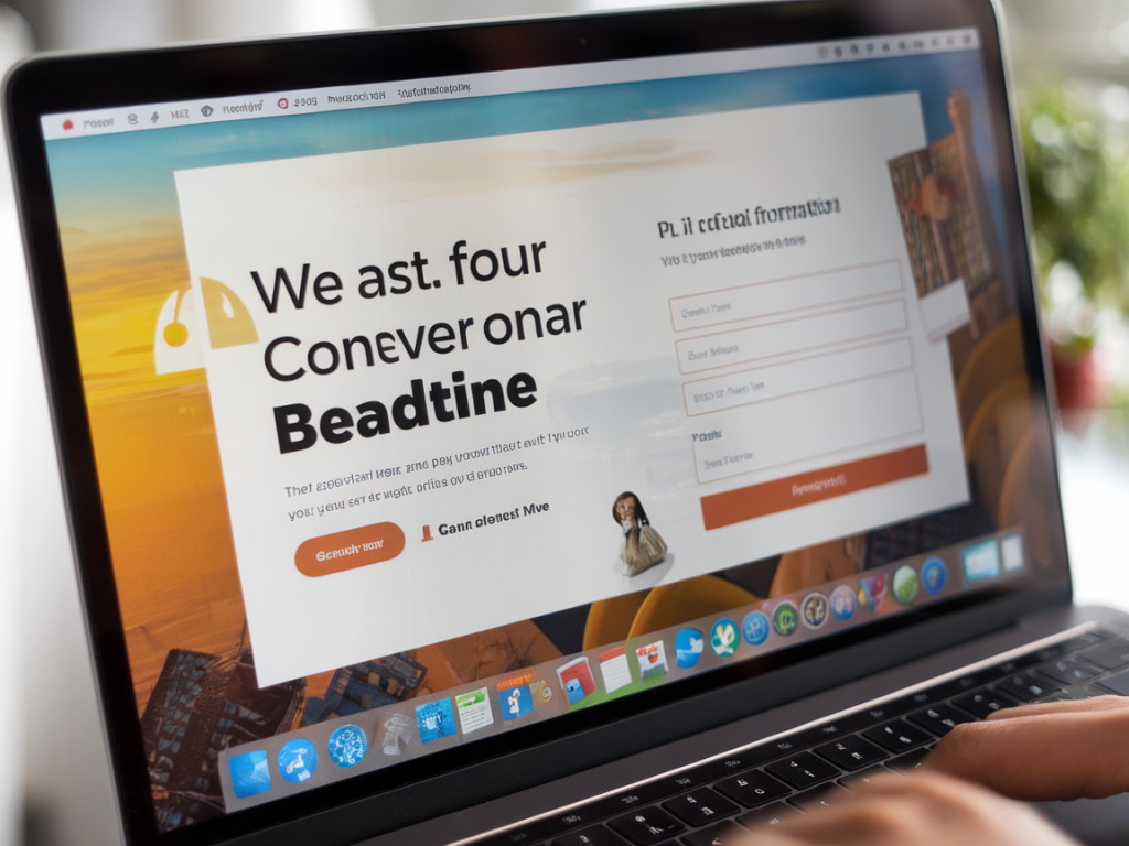
Choose the Right Template (Or Build Your Own)
HubSpot makes it incredibly easy to launch your first landing page with their drag-and-drop editor. Personally, I like starting with one of their optimized templates, especially when I’m working under tight deadlines. They're mobile-responsive, clean, and built for conversion. But if you want to go the extra mile, you can build a layout from scratch using HubSpot’s Design Tools or even integrate custom HTML/CSS.
Some key elements I always look for in a good landing page template:
- A prominent, benefit-focused headline.
- A form placed above the fold.
- Minimal navigation and no distracting outbound links.
- Space for visuals or video (yes, video converts!).
Write a Headline That Speaks to Real People
This is where so many landing pages fall flat. A good headline isn’t just about including keywords—it needs to resonate emotionally. I always ask myself: What problem am I solving, and why would my audience care?
For example, instead of saying “Download Our Marketing Guide”, I might go with “Discover the 5 Marketing Mistakes That Are Costing You Sales—And How to Fix Them”. See the difference? The second one speaks to a pain point and a benefit. That’s inbound thinking in action.
Craft Value-Focused Copy
The body copy should explain, concisely, why the offer matters. In my landing pages, I usually follow this simple structure:
- Problem: What pain point is my audience facing?
- Solution: What solution am I offering (and how is it different)?
- Benefits: What will the reader gain by taking action?
This structure not only helps you organize your thoughts, but it keeps the text persuasive and focused. And since I’m in the SEO space, I also optimize for relevant keywords without stuffing them. Tools like SEMrush or Ahrefs can help you identify key terms to include naturally.
Forms That Convert: Ask for What You Need (And Nothing More)
HubSpot lets you create smart forms that adapt based on who the visitor is—which is incredibly helpful. For cold leads, I stick to asking for just the basics: name, email, and perhaps one qualifying question.
I’ve learned the hard way that the more fields you ask to be filled out, the lower your conversion rate goes. Use progressive profiling and smart fields to collect more info over time as trust builds.
???? Pro Tip: Make use of HubSpot’s Lead Scoring features to evaluate form submissions based on your chosen criteria. This ensures you spend time nurturing your most qualified leads.
Design With Attention Flow In Mind
The way your landing page is laid out determines how your visitor interacts with it. My aim is always to lead the eye from headline, to body copy, to the CTA with as little friction as possible. This is where visual hierarchy comes in.
| Element | Design Tip |
|---|---|
| Headline | Use bold fonts and color contrast to make it pop |
| CTA Button | Use a color that contrasts with the rest of the page |
| Form | Keep it above the fold and limit the number of fields |
| Visuals | Use images or videos that reinforce your message |
Use Smart CTAs for Maximum Relevance
This is one of my favorite features inside HubSpot: Smart CTAs. Instead of showing every visitor the same call-to-action, you can personalize it based on their lifecycle stage, device, location, and more.
For example, I show returning visitors a different message compared to new ones—like offering a free consultation instead of just a downloadable guide. That little tweak can result in a nice bump in conversion rates.
Use A/B Testing and Analytics (Always)
The truth is, no landing page is "perfect" from day one. HubSpot's built-in A/B testing has made me a huge fan of experimentation. Sometimes changing just one word in a headline or the color of a CTA button makes a huge difference.
When I run tests, here's what I often experiment with:
- Headline copy
- CTA button text or color
- Form length
- Hero image or video
Then I use HubSpot’s analytics tools to track bounce rate, time on page, and submission rates. These insights directly inform my next round of optimization.
Integrate With Your Marketing Workflows
A landing page is far more effective when it’s connected to a wider inbound strategy. That’s why I link every form submission to a HubSpot workflow that:
- Tags the contact based on interest or funnel stage
- Sends a follow-up email with the promised content or offer
- Enrolls the contact in a relevant email nurture sequence
This automation is the heart of successful inbound marketing—it ensures that your leads don’t fall through the cracks once they convert.
And if you're working with multiple personas or offerings, segmentation becomes your best friend. HubSpot allows us to create highly customized nurture paths tailored to exactly what someone downloaded or showed interest in.
Creating high-converting landing pages isn’t rocket science—it’s strategy plus execution. And with the tools HubSpot brings to the table, we have everything we need to turn browsers into buyers. So if you're not leveraging these yet, there’s no better time to start than now.